Showing posts with label Shopping. Show all posts

Tuesday, September 10, 2019

Pro.found Fall Home Decor

I love Summer.


I grumble as the calendar turns to September and I go kicking and screaming like a two year old being dragged away from the beach.  But... this year is a little different. I cannot say why for certain. I did get more than my fair share of days at the beach this year so maybe that makes it a bit easier. It does seem that Labor Day weekend brought about the end or summer as the temperatures turned immediately cooler here in New England- like 20 degrees cooler during the day. Was there a switch that was flipped? The nights turned instantly cooler and lend to open windows and a covering of sheets and a blanket. Can I smell pumpkin spice in the air?


As summer comes to a close the thoughts turn to all things home. And, surprising to me, I'm ready to decorate for Autumn! I'm trying not to go crazy. Mister took me the Brimfield Antique Show last weekend but I left empty-handed! Mister picked out some things but not me.  I was looking for a couple items in particular but didn't find exactly what I was looking for. In the back of my overwhelmed brain (if you've ever been to Brimfield you can't help but be overwhelmed) I knew my heart was waiting for something better.

The weekend of September 21-22 some of the sweetest ladies will be putting on the next Pro.found Vintage Market. I've shared our trips to this market before here and here. I went to the market in late Spring this year and brought home some treasures for our yard. Here are some of things that caught my eye while shopping.


Mister brought home these two pieces for the yard.

                                                                       The compass rose.

                                                                  The Eat Here sign.

But it is Fall (even though the calendar doesn't yet agree) and I am ready to embrace it as I prepare to shop for some fall decor. If you're local come out to the Pro.found Vintage Market in Central Massachusetts! Put on your sweater and boots, grab a spiced cider donut and a cup of apple cider and enjoy the vibe these creative women have put together. I know I'll be there...

If you can't make it out many of the vendors have online shops! You can find links to them on Pro.found's vendor pages or check out their facebook pages.


**This is not a compensated/sponsored post. Opinions are my own. Photos are my own. I just love going there and supporting the talented people in my corner of the world.

Linking up to these parties:
Wonderful Wednesday Blog Hop, Ducks N' A Row, Katherine's  Corner, Imparting Grace , Our Hopeful Home, Knick of Time, Life With Lorelai, Shabby Art Boutique, Our Home Away From Home

Monday, August 5, 2019

Traditional Home Makeover- Part 7 Product Sources for Family Room


First, let me thank you for your patience if you have been following along. This makeover has taken way longer to write about than what actually happened in real time. In previous posts I have walked you through the front door into the foyer with an office and powder room to the left and formal living room to the right. Beyond the living room, in the back of the house, is the formal dining room. Following those posts, I brought you into the kitchen. Today, we will go into the family room!


This is a huge space with built in cabinetry on one wall. A beautiful palladian window sits opposite the empty, two story stairway that leads to the family's bedrooms.  A large entrance from the kitchen gives the feeling of an open concept living space. Originally, this room was a yellowy-taupe color. The drapery left the room feeling dark and cave like which is great if you want to close the curtains and watch a movie but doesn't do much aesthetically. This room was getting new furniture! So far, in other rooms, we have worked with existing furniture and built around those pieces.


**Actually, I am just going to share with you today some of the products that will be coming into this space because if I try to do all in one post it will go on for days. I realized this half way through writing this post. So here we go!

Our goal is to lighten, brighten and add a sense of the coast to this space while keeping it family friendly.

First off was wall color. Everything got moved to the center of the room and painting was done. Just that step alone made the room feel so much bigger! The color is Benjamin Moore's Balboa Mist. Never underestimate the power of paint!


Lighting fixtures matched what had been in the kitchen originally but with a simple shade change we ended up keeping the main portion of the fixtures. These are the same shades used in the kitchen pendant lighting.
                                        Product Image 1
                                                                       Source
                                               
A sectional from Macy's was ordered. The color is Nickel Grey.  The family of seven includes two small, very active little guys and the color has to be able to hide some "lived in" wear.
                                                          Source                                       

A pair of reclining leather club chairs were purchased from Pottery Barn during their 2-for-1 sale.  The color is Burnished Wolf Grey. Also purchased was a matching ottoman that will double as a "coffee table" in the sectional.

                                                                   Source

Neither the sectional nor the club chairs are a true grey, they are kinda a mix between grey and brown depending on the lighting/time of day. I love them!


A new large rug brought the color factor into what was a pretty gray pallet. My homeowner is not afraid of color but we want to do it in a measured way for the mister of the house. It plays nicely with the greys and browns.

                                                                   Source

Artwork, artwork, artwork brings in some color!


A console table and artwork will use up space on the stairway wall.


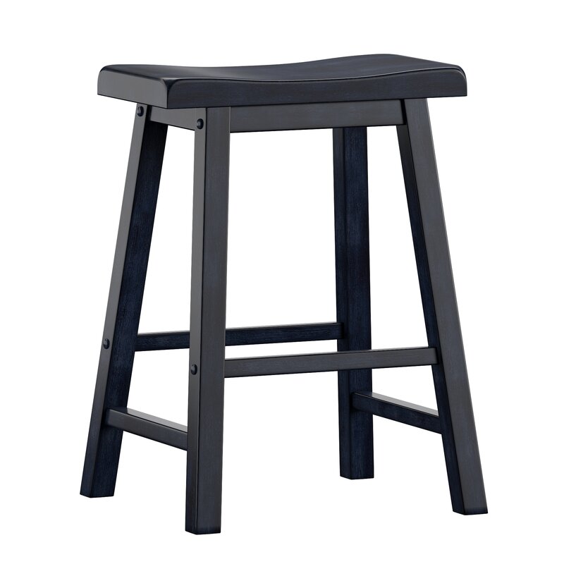
A sleek white table found on a yard sale site will provide space to fold clothes, do homework, or play on the laptop. Stools matching the kitchen stools, purchased from Wayfair in Antique Denim will accompany the piece.
                                                                   Source

A sofa table purchased through a yard sale site adds some warmth to the blues and grays. The homeowner found lamps that remind us of fish scales.


Accessories were purchased at Hobby Lobby, At Home and Home Goods. I found a large round tray at Home Goods that resembles the kitchen tile work.


Side tables were challenging. We opted for a tv table that pulls over the chaise on the sofa and a round table will nestle nicely between the club chairs.

                                      Berwyn Large Round End Table Metal And Wood Brown - Thresholdâ„¢ : Target
                                                                             Source

Pillows and drapery! The homeowner found someone on Etsy that would sew lined curtains using her white lattice fabric. The price was so reasonable! And, yes they had to be lined to block the sun during movie watching.


                                                                      Source

                                                                      Source

There were tons of little accessories added and a gallery wall going up the stairway. In the next post I will share the finished product! Please come by again soon... you don't want to have gone through all this to miss it!

Tuesday, July 9, 2019

Traditional Home Makeover-Kitchen (Part 6)

My goodness! You must be thinking that this job is never getting done. In truth it is done. It is just taking me a lifetime to finish writing about it!  So I've already walked you through the front door (which has changed since starting this whole thing), into the office and powder room, and then on to the not-so-formal living room and dining room. Next up is the kitchen.


When we started this was the room that felt most dated and underwhelming to me. In spite of the natural light this room has it felt dark. The cabinets are a red birch and that next to the deep red/burgundy wall color made the room feel brooding and somber-not at all my homeowner's personality. The lighting was a scroll-y, heavy, wrought iron piece with amber shades that only emphasized the darkness. All this was complemented by heavy black and gold curtains over the slider to the deck.

My friend was as eager to get started as I was and when I came to meet the painters she had already taken down the lights and curtains so "before" pictures are actually "in-the-process" pictures.


The folded fabric was the old curtains.


Tiles on the backsplash were in desperate need of updating but we are keeping the black granite countertops.


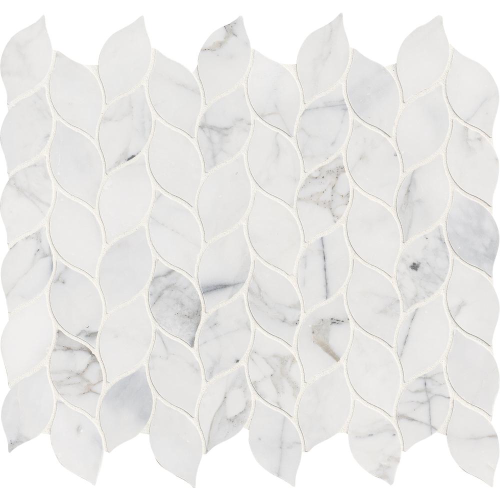
This is the tile we settled on. I. Love. It.

 (Source)

The room will get a much lighter coat of paint, new curtains and new lighting over the table and island.

Here are some products we used in the room. You can click on the word "source" next to each picture to go to the website where we purchased the products:


Wood Framed Signboard - It Is Finished - Multiple Sizes              (Source)

Beautiful of-the-moment colors and bold pattern come together in our striking Torrance Collection. Power loomed in Egypt of microfiber polyester, each piece is exceptionally soft with deep color saturation.This rug is available at our San Antonio... (Source)
Sharman Counter Height 24" Bar Stool        (Source)
 (Source)

The first set of glass shades had a very coastal feel but the homeowners didn't like seeing the bulbs through the glass, feeling it was harsh.

 (Source)


Based on that "fail" we chose this light for the over the kitchen table table. There are white shade inserts that hide the bulb but keep the light from being yellowed.
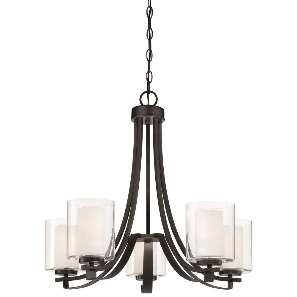
Minka Lavery Parsons Studio 5-Light Smoked Iron Chandelier(Source)

We settled on these shades for the pendant lights over the island. They have a sense of movement to them that reminds me of water but they are a true white so we don't get an amber cast from the light.
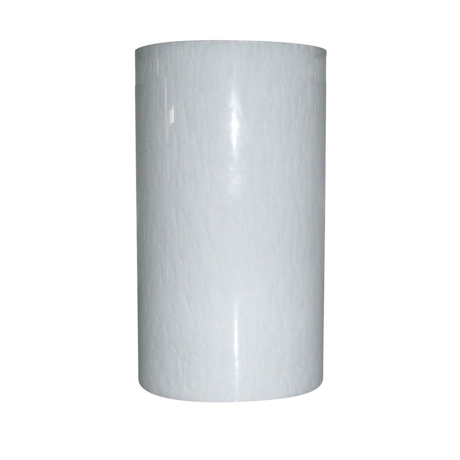
Product Image 1(Source)


Can you see that it looks like water? 

The walls were painted in Sterling by Benjamin Moore and I feel like I can take a deep breath walking into the space, as if filling my lungs with salt air. Remember the idea in this whole project is to lighten and brighten and bring a touch of that coastal feel into the main floor.

                                          One of over 3,500 exclusive Benjamin Moore colors.
                                                     

The tile for the backsplash was installed. *Just a brief note here. I hired a guy who ended up leaving us after taking the old tile off. Perhaps he was overwhelmed by the amount of cuts the new tile would need-not sure but it was disheartening. Integrity matters in every aspect of life. I contacted Home Advisor (a first for me) and was connected with a tile guy that not only could start the work that same day but he honored the price the previous guy gave us. If you're looking for a tile guy in Massachusetts, contact me and I will give you his info. You can also find it on my instagram account. Just look for picture of the tile.

This was his day 1: Gorgeous, right?!


We opted to install the tile giving us a horizontal pattern rather than vertical. I imagine on the diagonal would be beautiful, also.

And the finished product:


When ordering the the curtains for the slider to the deck we purchased an extra panel. My homeowner used that extra panel to make a faux roman shade for the window above the sink. I love this fabric! It is soft, almost like a velour but not. It has a beautiful weight to it. We used four panels for the slider, stitching two panels together, flanking either side of the slider.


See that runner! You will see that pattern again...


And, the kitchen table... with a slight peek into what is next...


Getting a full shot of this kitchen in perfectly clean order is nearly impossible in a home that consistently welcomes overnight guests, adding to the already busy home of a seven person family.

My homeowner loves color. The blues and grays give an airy feeling with a nice addition of color but she wanted just a smidge more. This is the artwork we used on the wall to the right when you enter the kitchen from the foyer:

Image
                                                                         (Source)
I'm kinda obsessed with this piece! Having said that I didn't get even one picture of it up on the wall! It brings in a lot of different blues which is perfect for what we have been doing on the main floor of this traditional home.

And with the kitchen done it brings us to the final room in this project which is the family room. I will take you in there in the next installment of this traditional home makeover.

Thanks for spending time with me and following along.