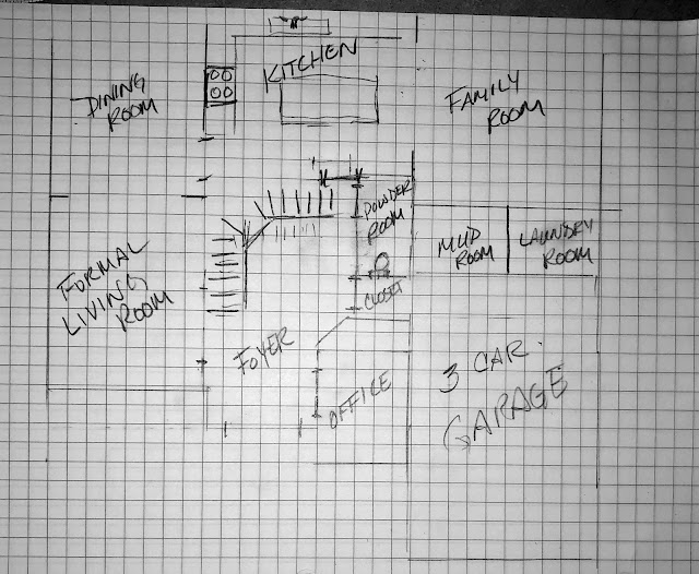
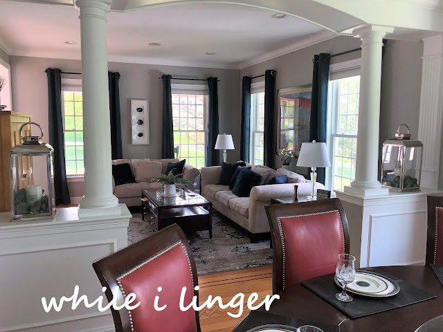
To the left of the foyer is the formal living room. Don't let the name of the room fool you. This family prefers a more informal space. Originally, the plan was to leave the wall colors the brown that was there. The homeowner didn't want to have to paint it or the adjacent dining room. The artwork below is the inspiration piece for everything we've done so far. We are keeping all the furniture. The blue pillows are color inspiration purchased to pull one of the blues from the art piece.
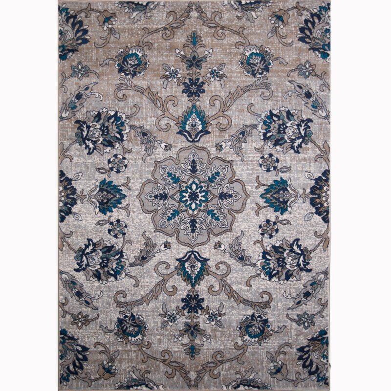
Once wall colors were changed in the rest of the first floor spaces it left those two rooms looking drab. The new color in the foyer is completely visible from the living room and dining room. In an attempt to marry the two color schemes we purchased a rug. While the new rug helped to unite the cool grays and warm browns it was felt a little like putting on a new dress directly after a sweaty workout at the gym.

(Source)
We tried several different curtains attempting to lighten the space but nothing worked well (except over exposing my photos in editing like the one below). The room still felt heavy and dark. The wall color sucked the light out of the room and made the new rug look dirty!
Ok, plan B; paint the walls. By this time our painter was gone and wouldn't be back for a couple months so armed with Frog Tape and paint brushes the homeowner and I got to work. Since neither of the rooms are vaulted and both had many windows it was relatively easy but a little time consuming. Prep work is your friend if you're not an experienced painter! Taping is a good thing and while it seems tedious initially, it will save you tons of work later. While I was present we got most of the taping done and the homeowner painted in the evening.
So much better!
After much conversation we decided to go with one color for both rooms as they are connected and the moulding is ornate. Adding another color would potentially have been just too much.
An arrangement on top of the cabinet insures that it does not revert back to a place that collects clutter. The wall piece was purchased at Pier 1, as was the floral branch.
We tried it before painting the room:
And after:
Home Goods and Target proved, once again as good resources to curate a coffee table arrangement.
Back to curtains... We decided to pull a bold pop of color from the painting and rug. We purchased solid colored panels in teal. The panels were on clearance but there were only 4 panels left! .... The windows already have nice honeycomb blinds and this room really doesn't have privacy issues so my homeowner (she sews) split each panel down the middle and finished the edges. We hung them in a stationary position as far out on the windows as possible to allow for light and make the windows appear larger. When privacy or light filtering is needed they can just pull the blinds. I love how this turned out, there is not a bunch of fabric taking up precious wall space. Sometimes, in rooms with many windows the curtains can take up valuable wall space or at least make it feel over-dressed. In this case it is good proportion of color in the space.
Just a hint of the dining room. We will move there next! Sign up for emails to make sure you don't miss anything or follow along on Facebook or Instagram.
So glad you could spend time with me!
Jolena
Linking Up
Shabby Art Boutique, Life With Lorelai, The Pin Junkie, The Cottage Market, Katherine's Corner, Our Hopeful Home, A Delightsome Life, Our Home Away From Home, Pieced Pastimes, DIY Showoff, Finding Silver Pennies, Create With Joy, Ducks 'N A Row, Skip To My Lou, The How To Home, Home Stories A to Z, Celebrate and Decorate, A Stroll Thru Life, My Uncommon Slice of Surburbia, DIY By Design, The Dedicated House


Jolene a little paint goes a long way and this color is so much brighter. I love the tip about splitting the curtains and making them into slim panels.
ReplyDeleteThank you, Mary! To keep those panels spaced properly you can cut a pool noodle in 2" segments and split them to slip over the rod behind each bend. No more trying to keep them evenly spaced!
DeleteWhat a beautiful room you have designed, warm and relaxing.
ReplyDeleteThank you for the kindness! You're always such an encouragement.
DeleteGreat tip on the curtains! Love the new wall color. Thanks for sharing at Vintage Charm. xo Kathleen
ReplyDeleteThanks, Kathleen and thanks for the party!
DeleteLove everything that you did in this room! It looks more peaceful and warm now. The curtains are a real jackpot and the bold, darker blue certainly makes a statement. The wall piece and branches are such great detail. Thank you for sharing, this is truly inspiring!
ReplyDeleteThank you, Katarina, for the kind words and for visiting with me!
DeleteJolena, I'm not finished with touring this home's makeover; in fact, I've been all over the place on your blog since reading your feature on Suzanne's post this morning. However, count me as your latest subscriber, I'm hooked! Back to reading about this home's makeover (great job!).....
ReplyDeleteYikes! Rita, I completely missed this comment, too! I am so glad to know that you are following along. Thanks for subscribing and for being so patient!
Delete