

When we started this was the room that felt most dated and underwhelming to me. In spite of the natural light this room has it felt dark. The cabinets are a red birch and that next to the deep red/burgundy wall color made the room feel brooding and somber-not at all my homeowner's personality. The lighting was a scroll-y, heavy, wrought iron piece with amber shades that only emphasized the darkness. All this was complemented by heavy black and gold curtains over the slider to the deck.
My friend was as eager to get started as I was and when I came to meet the painters she had already taken down the lights and curtains so "before" pictures are actually "in-the-process" pictures.

The folded fabric was the old curtains.


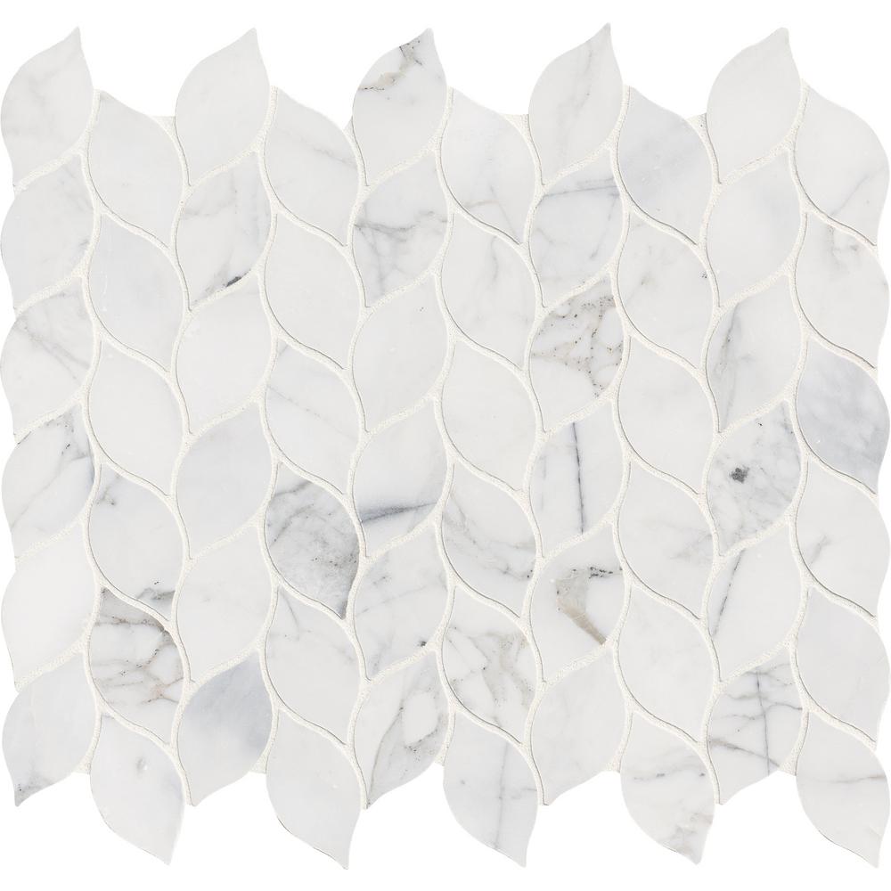
Tiles on the backsplash were in desperate need of updating but we are keeping the black granite countertops.

This is the tile we settled on. I. Love. It.
 (Source)
The room will get a much lighter coat of paint, new curtains and new lighting over the table and island.
Here are some products we used in the room. You can click on the word "source" next to each picture to go to the website where we purchased the products:
 (Source)
 (Source)
 (Source)
 (Source)
The first set of glass shades had a very coastal feel but the homeowners didn't like seeing the bulbs through the glass, feeling it was harsh.
 (Source)
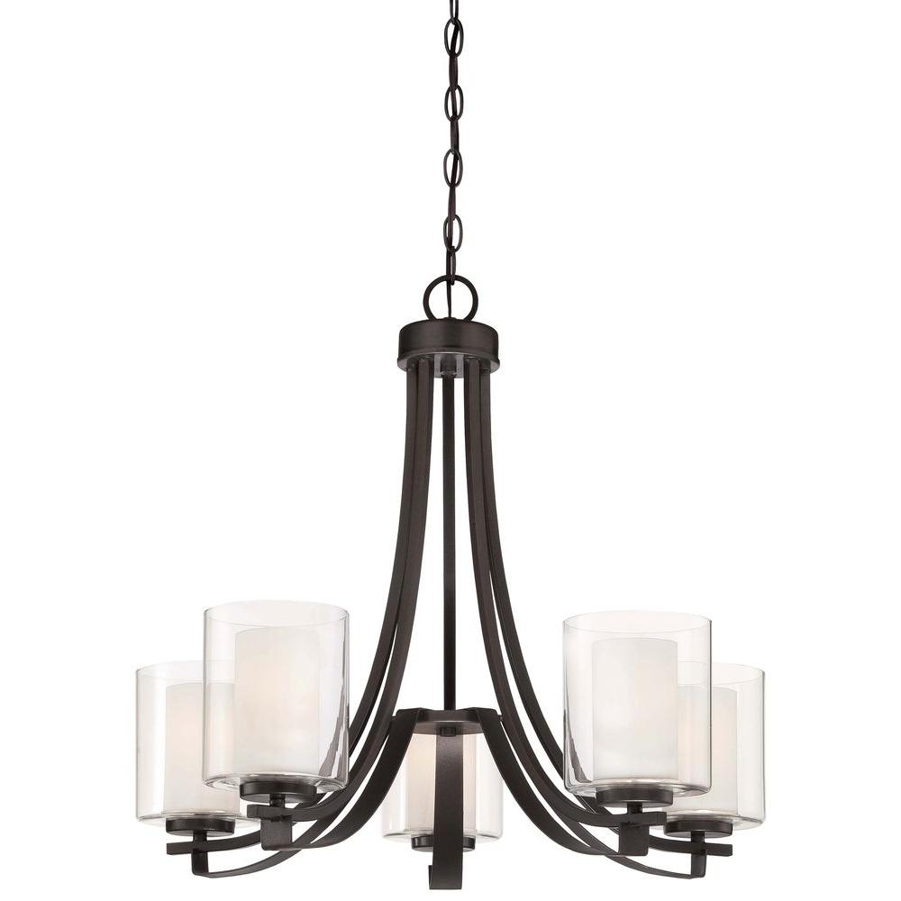
Based on that "fail" we chose this light for the over the kitchen table table. There are white shade inserts that hide the bulb but keep the light from being yellowed.
 (Source)
We settled on these shades for the pendant lights over the island. They have a sense of movement to them that reminds me of water but they are a true white so we don't get an amber cast from the light.
 (Source)
Can you see that it looks like water?
The walls were painted in Sterling by Benjamin Moore and I feel like I can take a deep breath walking into the space, as if filling my lungs with salt air. Remember the idea in this whole project is to lighten and brighten and bring a touch of that coastal feel into the main floor.

The tile for the backsplash was installed. *Just a brief note here. I hired a guy who ended up leaving us after taking the old tile off. Perhaps he was overwhelmed by the amount of cuts the new tile would need-not sure but it was disheartening. Integrity matters in every aspect of life. I contacted Home Advisor (a first for me) and was connected with a tile guy that not only could start the work that same day but he honored the price the previous guy gave us. If you're looking for a tile guy in Massachusetts, contact me and I will give you his info. You can also find it on my instagram account. Just look for picture of the tile.
This was his day 1: Gorgeous, right?!

We opted to install the tile giving us a horizontal pattern rather than vertical. I imagine on the diagonal would be beautiful, also.
And the finished product:

When ordering the the curtains for the slider to the deck we purchased an extra panel. My homeowner used that extra panel to make a faux roman shade for the window above the sink. I love this fabric! It is soft, almost like a velour but not. It has a beautiful weight to it. We used four panels for the slider, stitching two panels together, flanking either side of the slider.


See that runner! You will see that pattern again...

And, the kitchen table... with a slight peek into what is next...

Getting a full shot of this kitchen in perfectly clean order is nearly impossible in a home that consistently welcomes overnight guests, adding to the already busy home of a seven person family.
My homeowner loves color. The blues and grays give an airy feeling with a nice addition of color but she wanted just a smidge more. This is the artwork we used on the wall to the right when you enter the kitchen from the foyer:

(Source)
I'm kinda obsessed with this piece! Having said that I didn't get even one picture of it up on the wall! It brings in a lot of different blues which is perfect for what we have been doing on the main floor of this traditional home.
And with the kitchen done it brings us to the final room in this project which is the family room. I will take you in there in the next installment of this traditional home makeover.
Thanks for spending time with me and following along.
Jolena
party time:
Our Home Away From Home, Happiness Is Homemade, The Dedicated House, Celebrate & Decorate, Finding Silver Pennies, DIY Showoff, Create With Joy, Home Stories A to Z, A Stroll Thru Life, Katherine's Corner, Life With Lorelai, A Delightsome Life, Chic On A Shoestring, Shabby Art Boutique, The Pin Junkie
My goodness so much to look at and admire. A stunning makeover.
ReplyDeleteI love the color pallet and I am glad others are liking it too! Thank you for the kindness and for visiting with me!
Delete